


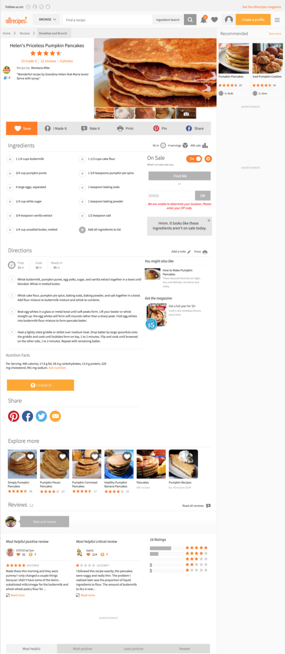


Johan Kohlin
Lecturer at School of engineering, Jönköping University.
<head>
<meta name="viewport" content="width=device-width, initial-scale=1">
...
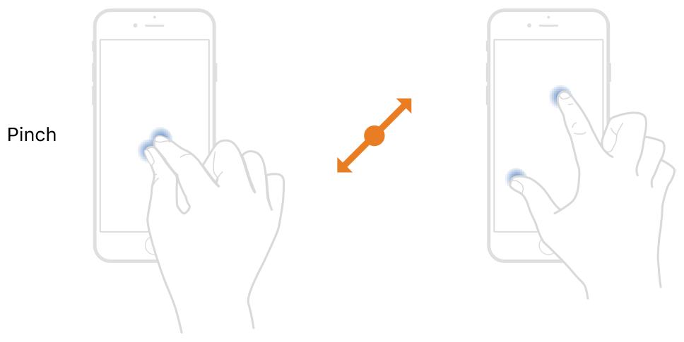
</head>Pinch: Just a fallback solution
for a fluid layout
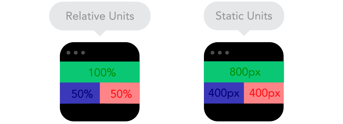
Units with relative sizes are:
50% = half of parent element width
50vw = half of browser window width
100vh = entire browser window height
img, video {
  max-width: 100%;
}
It means:
Be as big as you can
but never bigger than your actual size.
To serve the optimal sized image, see responsive images
add screen size breakpoints in your layout
@media (min-width:640px) {

  .page-content {
    flex-direction: row;
  }
  .hero {
    background-image:url(large.png);
  }

}
hides these rules until the browser is wider than 640px
groups/surrounds rules for a specific context
Usually, at the end of your CSS-file (where it overwrite previous rules)
@media type and (feature){


}
rules to apply when type and feature is true, go inside these curly brackets
specifies a target medium
@media print {

}
@media screen {

}
@media speech {

}
when viewed in a device's browser
when web page is printed
when web page is read by screen reader
screen
screen
speech
specifies media properties
@media (feature: value) and (feature: value) {

}
To combine multiple feature tests use and or , (comma means or). See here for more logic
| Feature | Value | Description |
|---|---|---|
| min-width | e.g. 480px | if the device is at least this big |
| max-width | e.g. 50em | if the device is no more than this value |
| orientation | portrait, landscape | If the browser is more wide than tall, or the device is upright or not |
| min-resolution | 192dpi | only for high resolution displays |
| max-resolution | 96dpi | for standard displays |
| -webkit-min-device-pixel-ratio | 2 | Safari on retina displays |
@media screen and (min-width: 480px){

}
@media (min-width: 480px){

}
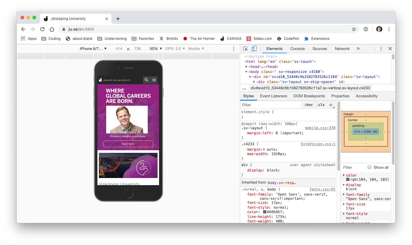
jonkoping.se / January 2012
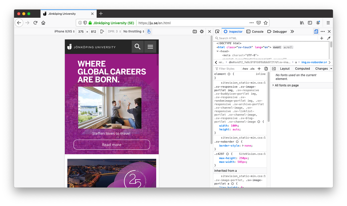
jonkoping.se / July 2012
a little too extreme
Chrome
Firefox
Safari
1. Preferences / Advanced/ Show developer menu...
2. Develop / Enter responsive deign mode
Don't worry about device widths. Go for weird looks.
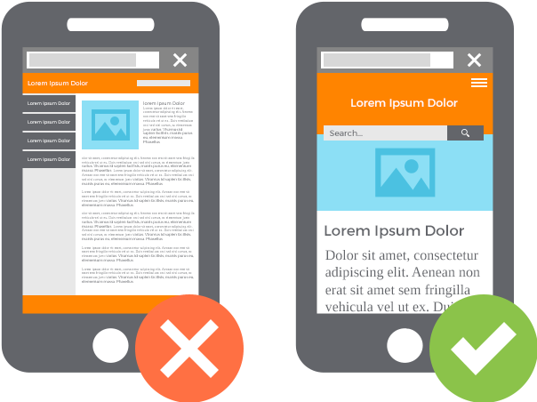
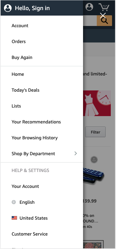
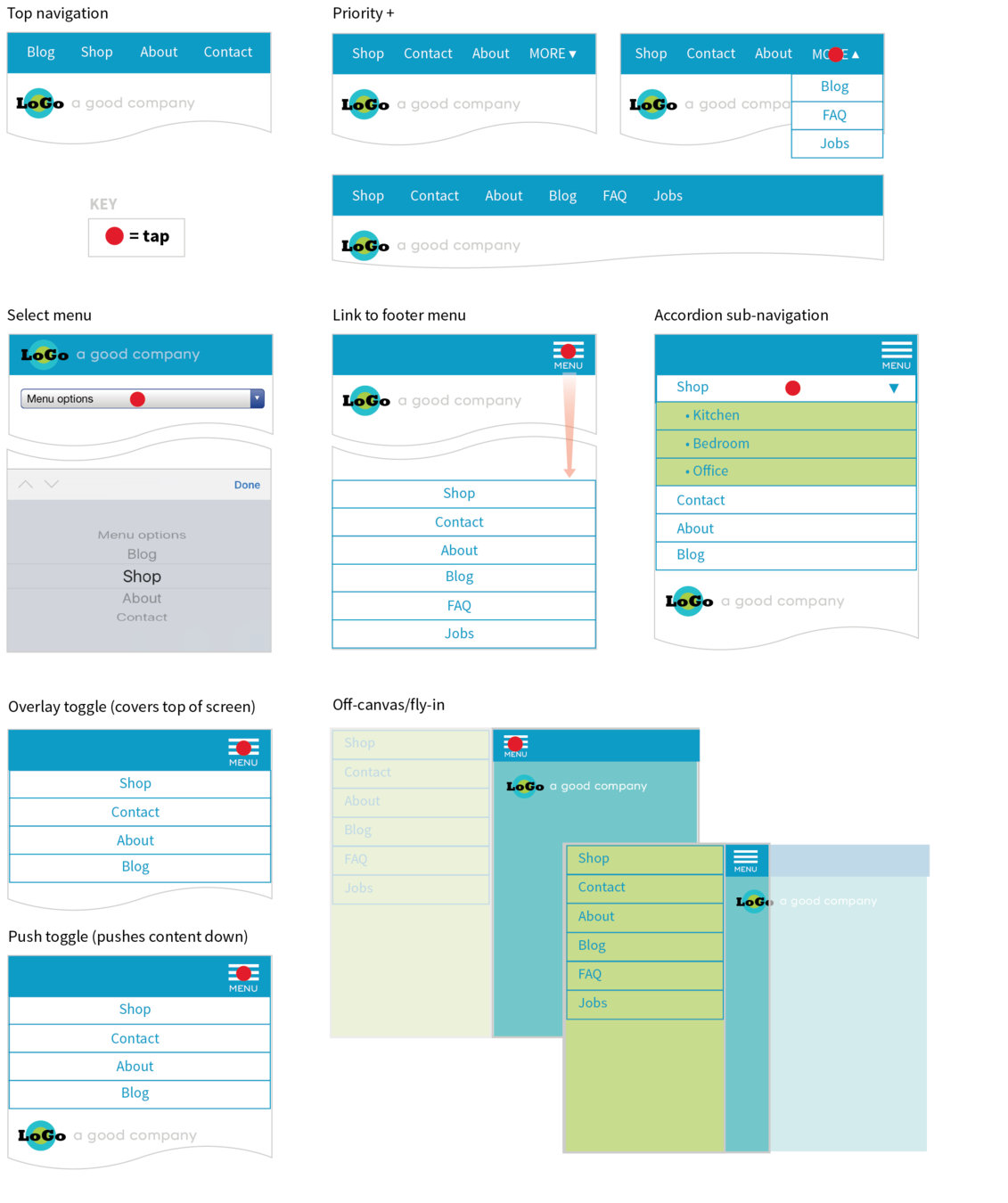
Don't leave it out, show it on demand
Dropping portions of your site on small screens because you think mobile users won’t need it is false thinking.
-Jennifer Robbins
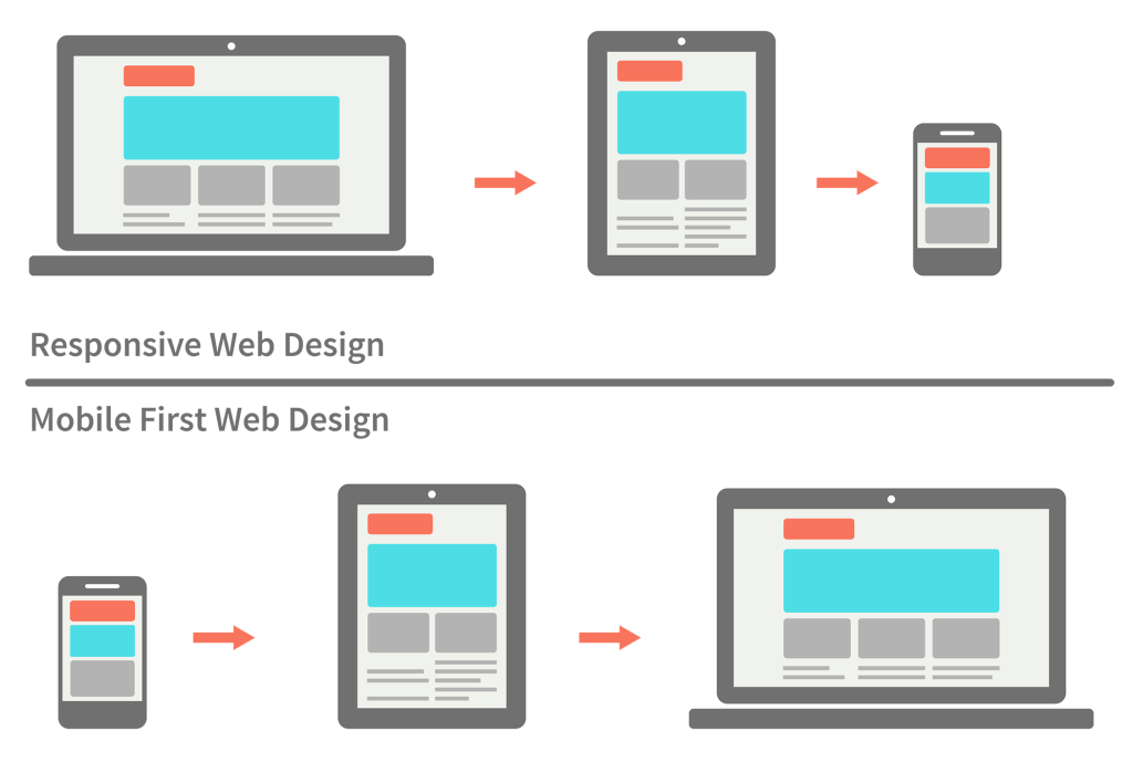
responsive strategies
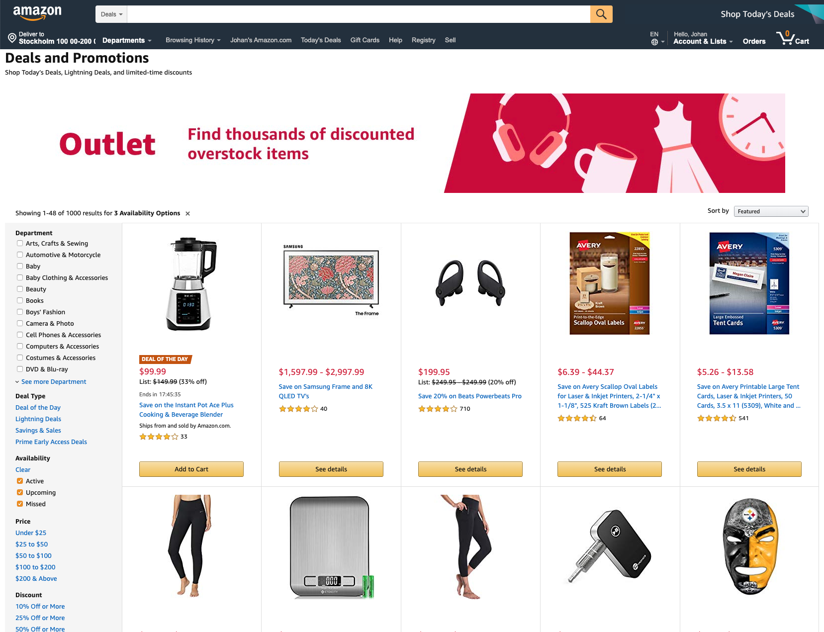
Mostly fluid
Column drop
Off canvas
Example:
Example:
Example:
Example:
Example:
By Johan Kohlin
Responsive design


