


Johan Kohlin
Lecturer at School of engineering, Jönköping University.
How to minimize
graphical content delivery over the internet
to make your site faster
and more sustainable.
Photoshop, HTML, CSS
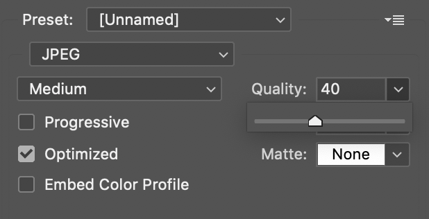
.jpg
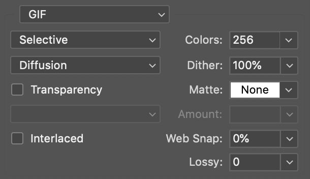
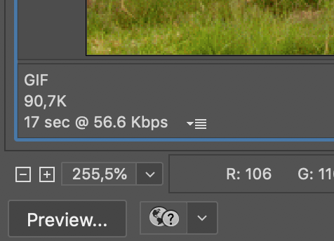
.gif
.png
.svg
quality: 8/10 (67Kb)
quality: 1/10 (8Kb)
Use for photos
max 256 colors, can be animated
256 colors (92Kb)
8 colors (18Kb)
Use for text/graphics/ animations
24 bit (248Kb)
8 bit, 8 colors (18Kb)
PNG-24
Use for text/graphics with transparency
PNG-8
Use for text and graphics
Shrink further: https://squoosh.app
Scalable Vector Graphics
Use for illustrations,
text and graphics
Apologies for the ugly drawing
shrink further: SVGOMG
The best from GIF, JPG and PNG
About: https://developers.google.com/speed/webp
Browser Support: https://caniuse.com/#feat=webp
but support is yet far from usable
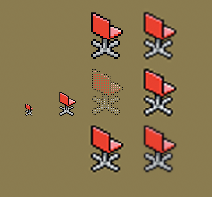
Changing size of an image, blurs it
bicubic smoother
bicubic sharper
bilinear
bicubic
nearest neighbour
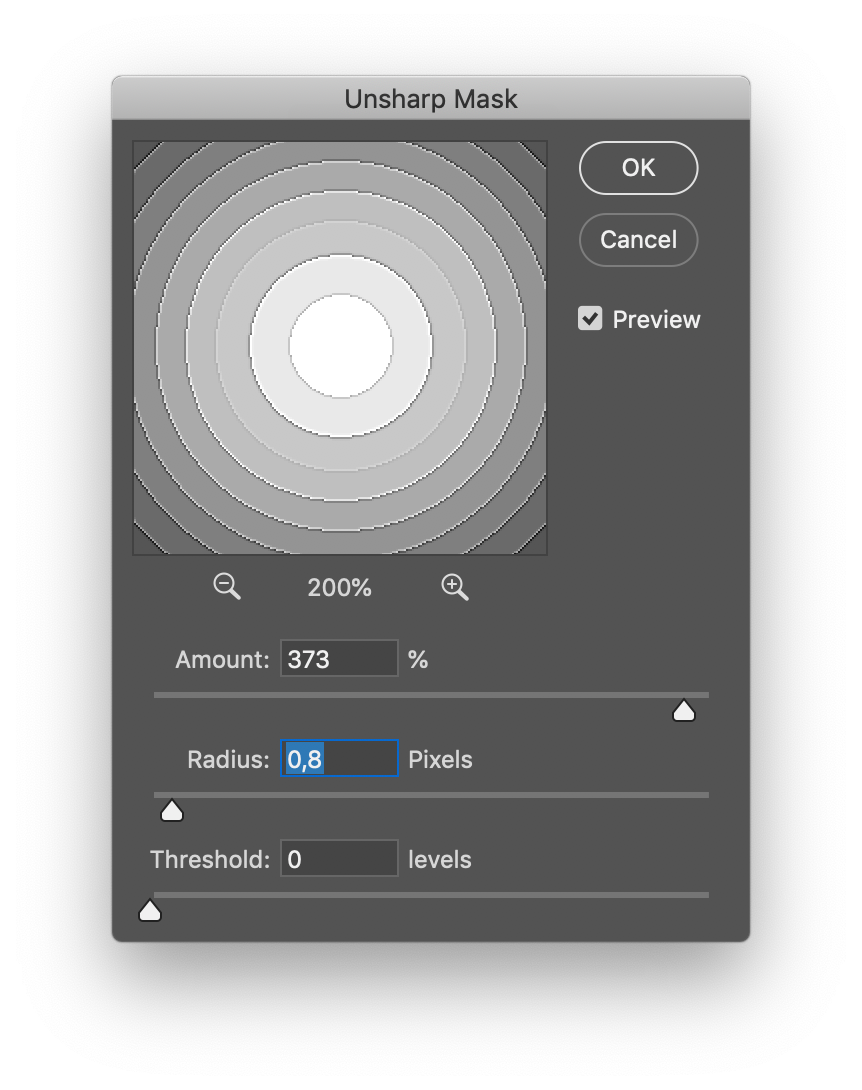
Make it sharp again with Filter/unsharp mask
Low radius
High amount
Increase to remove noise
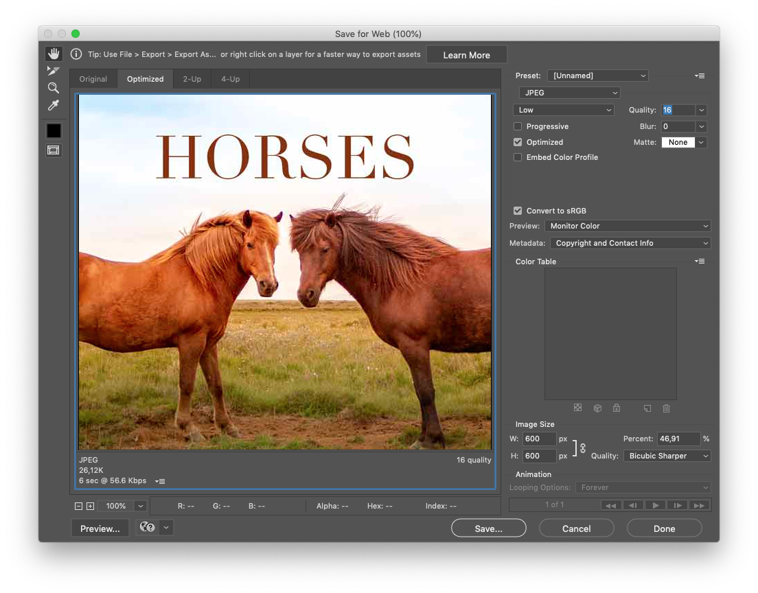
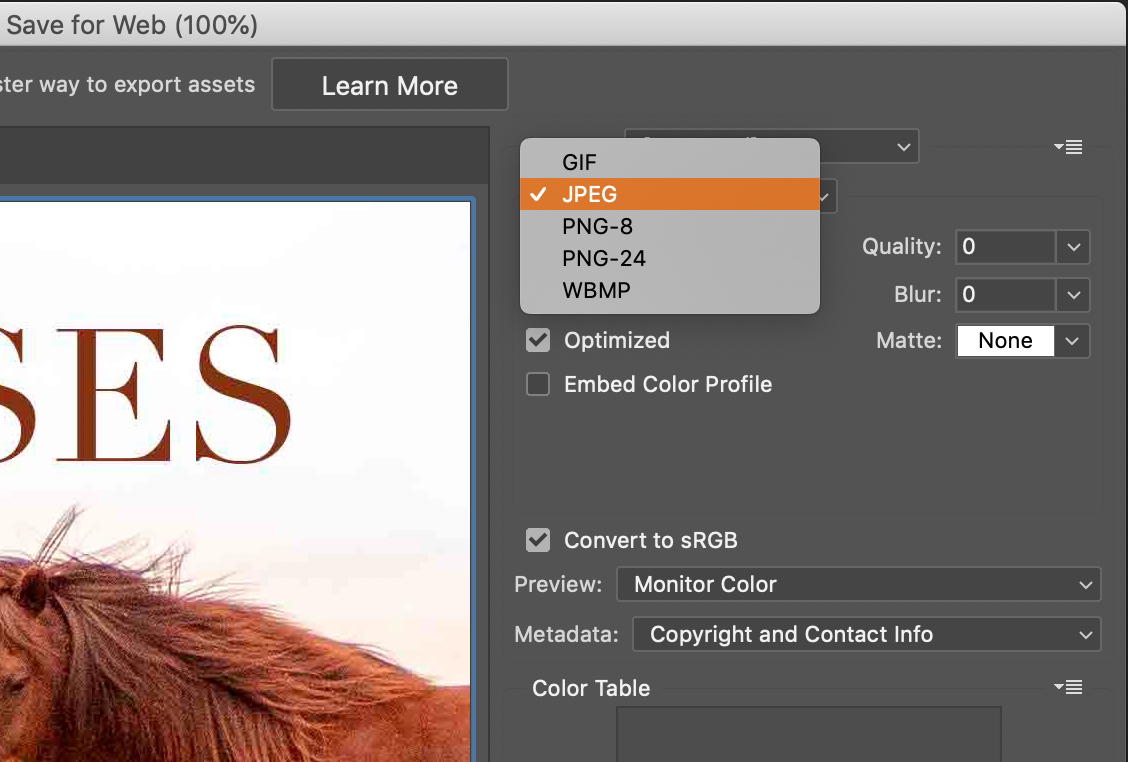
Step #1 Select a file format
Step #2 choose compression
Step #3 check size vs quality
(change background images)
.image-container {
  background-image: url('low-res.jpg');
}

@media (min-width:720px) {
  .image-container {
    background-image: url('hi-res.jpg');
  }

}<img src="low-res.jpg" alt="" srcset="" sizes=""><picture>
<source srcset="" media="">
<source srcset="" media="">
<img src="low-res.jpg" alt="">
</picture>
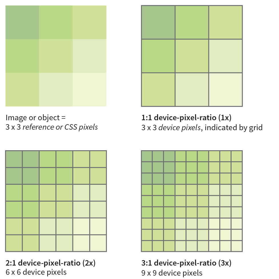
(pixel density - screen resolution)
1 CSS pixel or Reference pixel
4 or 9 actual pixels on the device screen
1 CSS pixel = 1pt = 1/72 inch
but first...
as supplement attribute to the img element
use case #1 –screen resolution alternatives
Device-pixel-ratios
<img
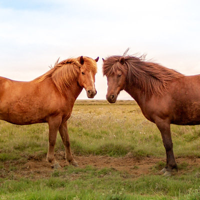
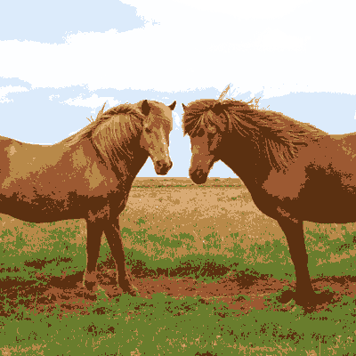
src="images/horses_lowres.jpg"
alt="icelandic horses"
width="400"
srcset="images/horses1x.png 1x,
images/horses2x.png 2x"
>use case #2 –screen size alternatives
screen size
you also need to use the sizes attribute to tell the browser the approximate size that the image will appear in the page’s layout
<img
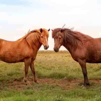
src="images/horses_lowres.jpg"
alt="icelandic horses"
srcset="images/horses_small.png 400w,
images/horses_large.png 800w"
<!-- One more thing is needed.
See next slide -->
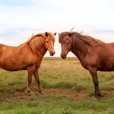
>sizes="(min-width: 480px) 50vw, (min-width: 768px) 33vw, 100vw"
screen size
the combo for alternative image sizes based on viewport width
<img
  src="images/horses_lowres.jpg"
  alt="icelandic horses"
  srcset="images/horses_small.png 400w,
          images/horses_large.png 800w"
  sizes=" (min-width:480px) 50vw,
          (min-width:960px) 33vw,
          100vw"
>Take control over what image gets loaded when
Take control over what image gets loaded when
<picture>
  <source media="(min-width: 600px)" srcset="mountains_desktop.jpg">
  <source media="(orientation:portrait)" srcset="mountains_portrait.jpg">
  <img src="mountains_lowres.jpg" alt="mountains in the horizon">
</picture>only browsers with support for that type will show it
<picture>
  <source srcset="WebPImage.webp" type="image/webp">
  <source srcset="creakyOldJPEG.jpg" type="image/jpeg">
  <img src="lowres.jpg" alt="">
</picture>loading="lazy"
<img src="below_the_fold.jpg" alt="" loading="lazy">Only load images that are about to be scrolled into view
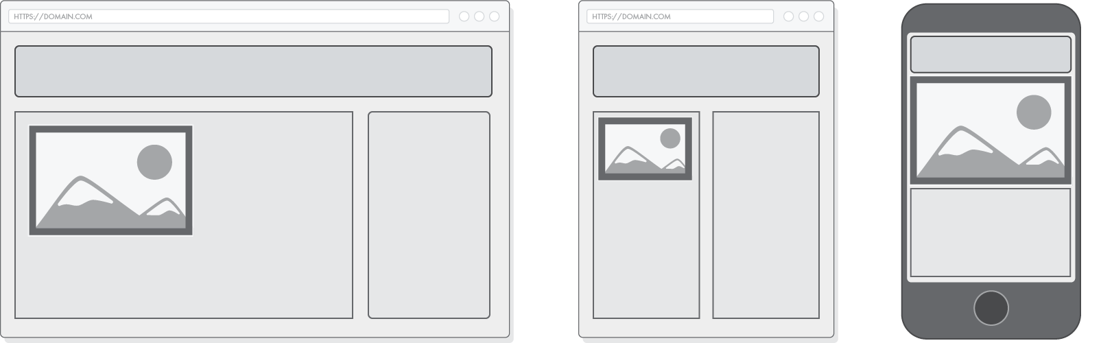
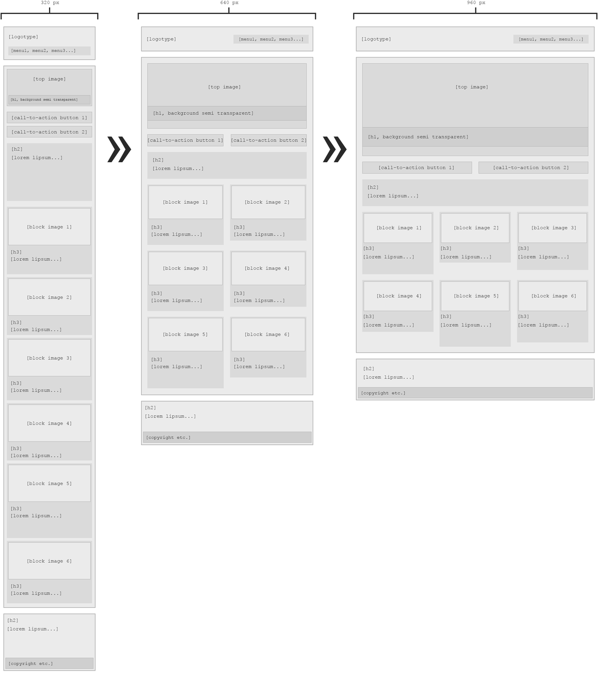
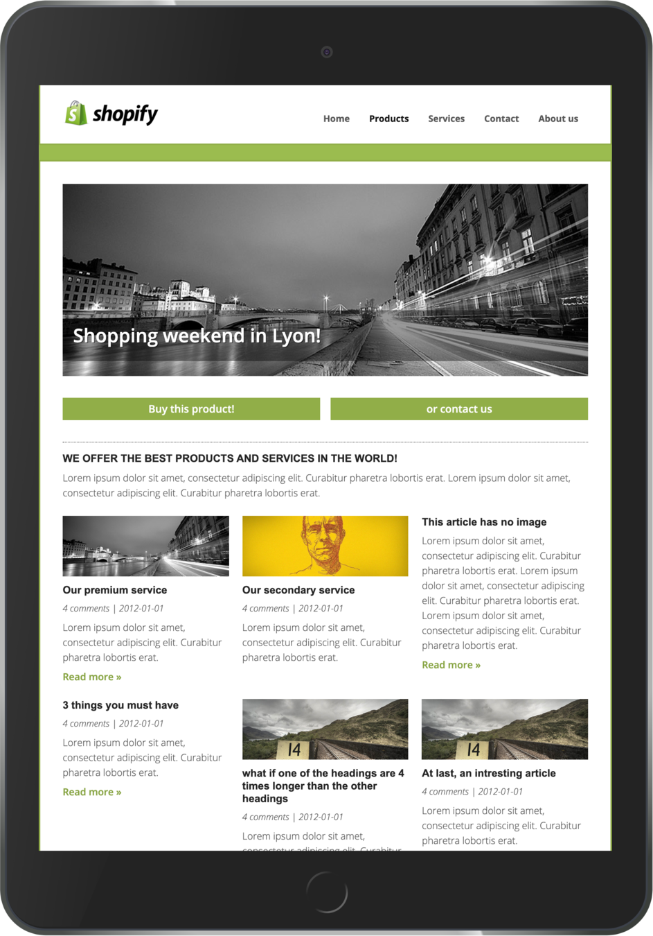
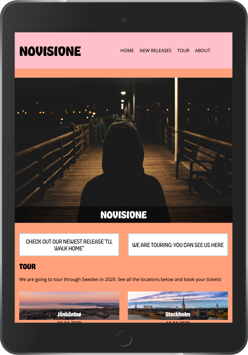
based on these wireframes
Read Chapter 18
By Johan Kohlin
Images; HTML responsiveness, CSS-responsiveness, web-optimization


