


Johan Kohlin
Lecturer at School of engineering, Jönköping University.
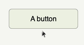
The super easy trick to get started with animations: transition
.button {
    transition: 0.2s;
}

.button:hover {
    background-color:lime;
    box-shadow: 0 2px 4px;
}The super easy trick to get started with animations: transition: 0.2s
/*
transition-property
transition-duration
transition-timing-function
transition-delay
*/
transition: all 0.5s ease 0s;
the property transition is a shorthand for
transition-property: color, border, width;
transition-property: all; /* default */
All animatable properties: see Table 18-1 in the book
background-color
background-position
Borders and outlines
border-bottom-color
border-bottom-width
border-left-color
border-left-width
border-right-color
border-right-width
border-top-color
border-top-width
border-spacing
outline-color
outline-width
color
opacity
visibility
font-size
font-weight
letter-spacing
line-height
text-indent
text-shadow
word-spacing
vertical-align
height
width
max-height
max-width
min-height
min-width
margin-bottom
margin-left
margin-top
padding-bottom
padding-left
padding-right
padding-top
top
right
bottom
left
z-index
clip-path
transform
transform-origin
transition-duration: 500ms;
transition-duration: 0.5s
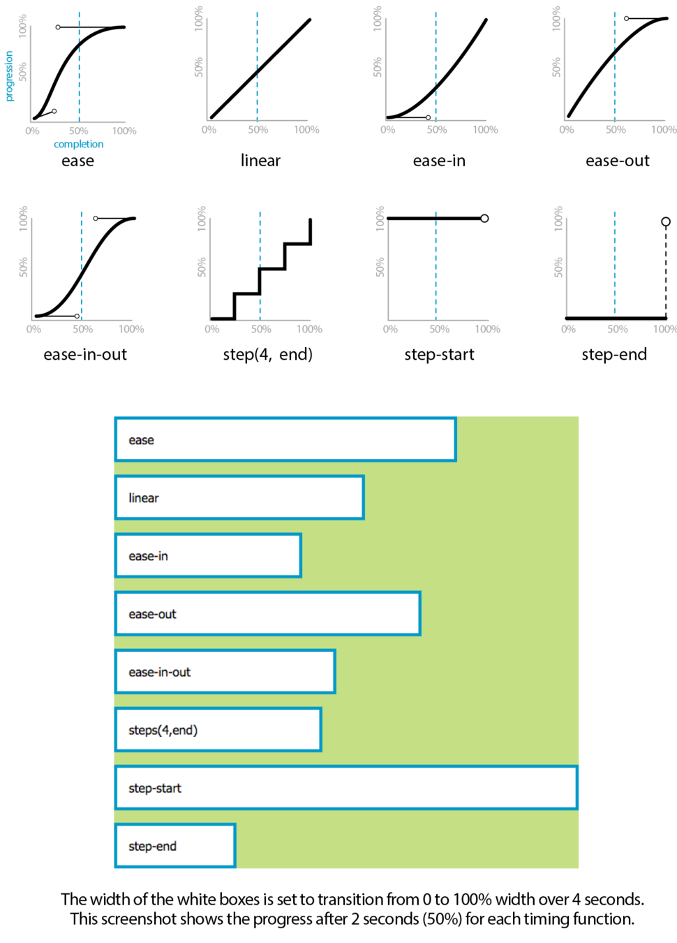
transition-timing-function: ease; /* default */
transition-delay: 0s; /* default */
transition-delay: 2000ms;
(or by adding a class with javaScript)
| pseudo-class | description |
|---|---|
| :target | a document fragment that match the URL (ju.se#id) |
| a:link | unvisited link |
| :hover | when mouse is over the selector |
| :active | mouse is pressed down (links and buttons) |
| :checked | a checkbox form element is checked |
| :focus | a text form element is in focus |
Requires two parts:
part #1 the @keyframes rule
part #2: the animation property
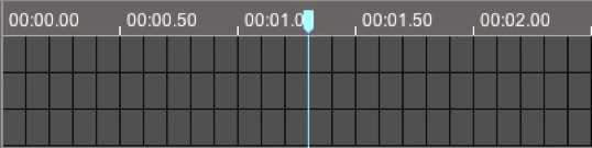
This is the timeline for the animation
@keyframes animName {
  0% {}
  50% {}
  100% {}
}
If the duration of this animation is set to 2s,
0% is at the beginning, 50% means after 1s
Choose an animation name of your choice.
Each keyframe selector can have as many CSS properties as you want
@keyframes animName {
  ...
  50% {
    background-color: red;
    width:200px;
    border-radius:10px;
  }
  ...
}@keyframes animName {
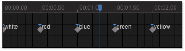
0% {background-color: white;}
25% {background-color: red;}
50% {background-color: blue;}
75% {background-color: green;}
100% {background-color: yellow;}
}
The length of this "movie" is set with the animation property
Where the animations gets applied to an element and settings for the animation is set.
#banner {
  animation-name: animName;
  animation-duration: 2s;
  animation-timing-function: ease-out;
  animation-delay:0.5s;
  animation-iteration-count: infinite;
  animation-direction: normal;
  animation-fill-mode: forwards;
  animation-play-state: paused;
}
must match the @keyframes rule you want to use
animation-name: colorAnim;


@keyframes colorAnim{

  0% {background-color: white;}

  50% {background-color: blue;}

  100% {background-color: yellow;}

}How many times you want your animation to loop
animation-iteration-count: 1;
animation-iteration-count: infinite
Play the timeline forward or backward..
normal (play forwards)
reverse (play backwards)
alternate* (forwards then backwards)
alternate-reverse* (backwards then forwards)
*if animation-iteration-count is more than 1
How the animation ends
none (back to 0% keyframe)
forwards (stop at 100% if direction is normal)
backwards (stop at 0% if direction is reverse)
both (stop at 0% or 100% depending on direction)
Whether the animation should be running or paused.
animation-play-state: running;
animation-play-state: paused;
animation: name duration direction iterations;
when size and color animation bores you
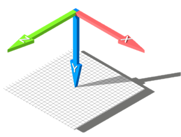
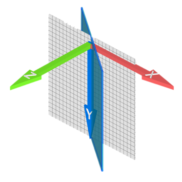
move elements around using the computers GPU
Move - translate
Twist - rotate
Resize - scale
Translate works similar to Position relative. Move from current position
transform: translateX(100px)

transform: translateY(100px)

transform: translateZ(100px)
transform: rotateX(45deg)

transform: rotateY(45deg)

transform: rotateZ(45deg)transform: scaleX(0.5)
transform: scaleY(2)
transform: scale(1.5) /* uniform */space separated
transform: translateX(100px) rotateZ(15deg) scale(0.5);
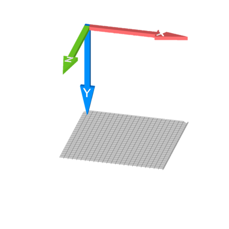
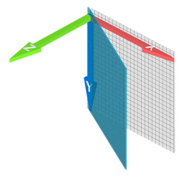
How close you are to the object.
Property is set on parent tag.
perspective:400px


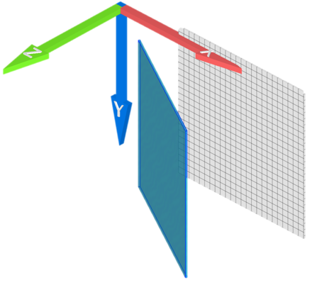
perspective:800pxMove the 3D axis origin
transform-origin: x y
transform-origin:50% 0;Move the 3D axis origin
transform-origin: 0 0;Move the 3D axis origin
see example on slide below
transform-origin: -50% 0;Book chapter 9 + 20 (Introduction to Preprocessors
By Johan Kohlin
Transform & Animation


