


Johan Kohlin
Lecturer at School of engineering, Jönköping University.
Book chapter 9 + 20 (Introduction to Preprocessors)
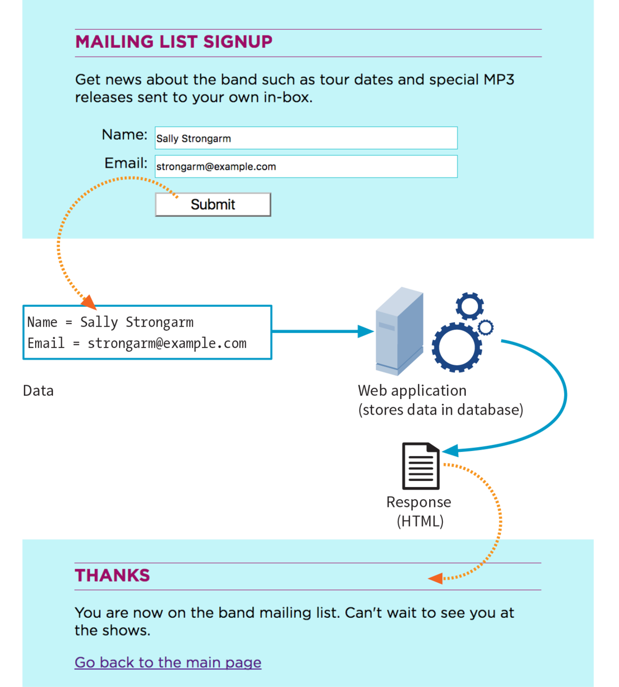
<form action="login.php" method="post" >


</form>
The form element should contain all form fields. It's non visible.
The action attribute is where the form information should be sent to
The method is how it's gonna get there (post or get)
You can use the action to go to the next page in your prototype
All form controls are input-elements*
* Exceptions:
<textarea name="long-text" cols="30" rows="10"></textarea> Which creates a big text box for long answers

<button>Button text</button> which can be used instead of <input type=submit>
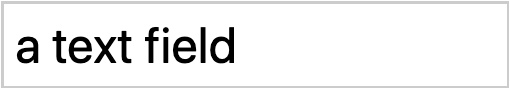
the basic text field
hides the input from people behind your back
Submits the form information to the specified action-page
CSS selector: input[type='password']
For grouping form elements
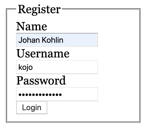
    <form action="login.php" method="post">
        <fieldset>
            <legend>Register</legend>

            <label for="name">Name</label>
            <input type="text" name="name">

            <label for="user">Username</label>
            <input type="text" name="user">

            <label for="password">Password</label>
            <input type="password" name="password">

            <button>Login</button>
        </fieldset>
</form>important for accessibility
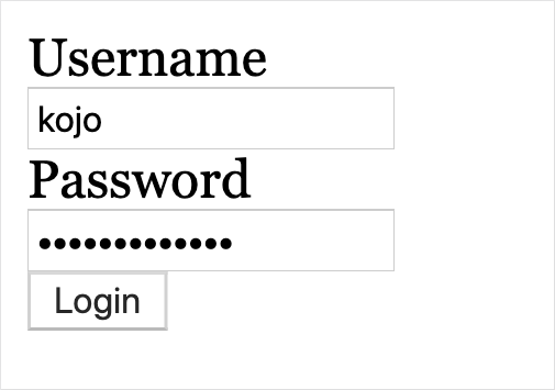
<form action="login.php" method="post">
  <label for="user">Username</label>
  <input type="text" name="user">

  <label for="pass">Password</label>
  <input type="password" name="pass">

  <button>Login</button>
</form>
(explicit label association)
They all need to have the same name attribute
<fieldset>
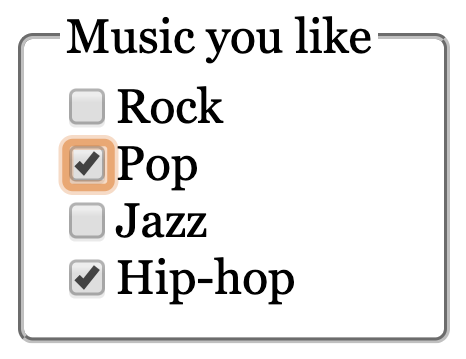
<legend>Music you like</legend>
<label>
<input type="checkbox" name="music" value="Rock">Rock
</label>
<label>
<input type="checkbox" name="music" value="Pop">Pop
</label>
<label>
<input type="checkbox" name="music" value="Jazz">Jazz
</label>
<label>
<input type="checkbox" name="music" value="Hip-hop">Hip-hop
</label>
</fieldset>(implicit label association)
They all need to have the same name
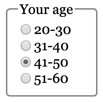
<fieldset>
    <legend>Music you like</legend>
    <label>
        <input type="radio" name="age" value="20-30">
        20-30
    </label>
    <label>
        <input type="radio" name="age" value="31-40">
        31-40
    </label>
    <label>
        <input type="radio" name="age" value="41-50" checked>
        41-50
    </label>
    <label>
        <input type="radio" name="age" value="51-60">
        51-60
    </label>
</fieldset>
(implicit label association)
CSS :checked
(don't forget to reference where the code comes from if you use it in your projects)
Making use of the soft keyboard
<input type="text">
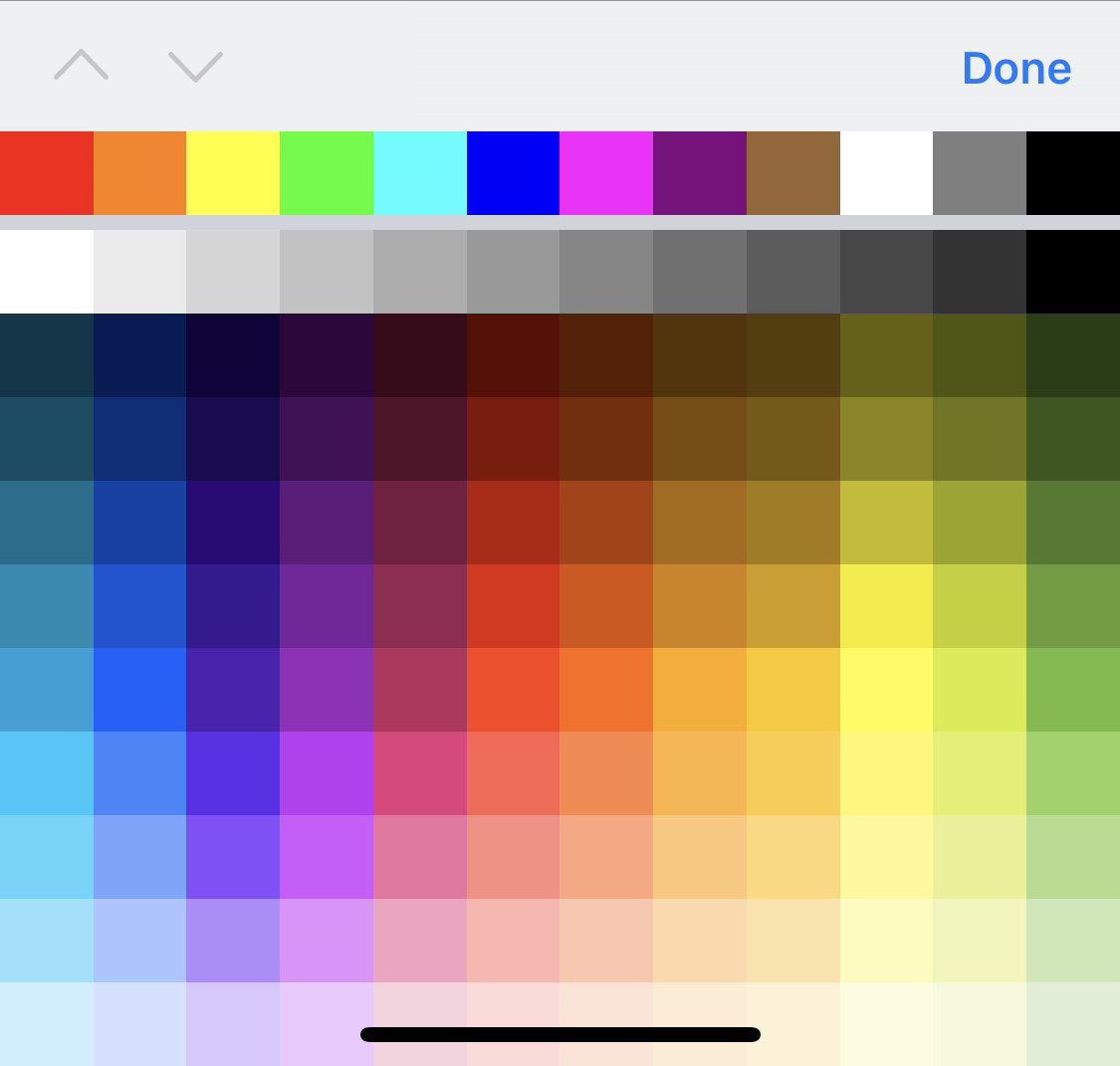
<input type="color">
<input type="email">
<input type="number">
<input type="tel">
<input type="url">
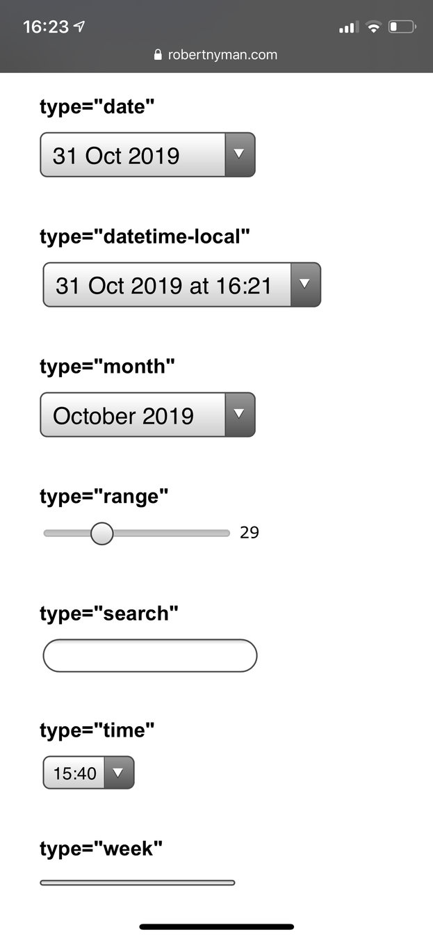
<input type="date">
Date input control
<input type="datetime-local">
Date and time control
<input type="month">
Specifies a month in a year
<input type="time">
Time input control
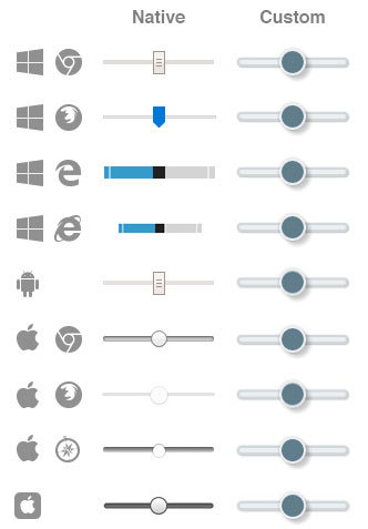
The slider
<input type="range" min="0" max="10" step ="1">Range:
The range form control looks different on different devices
Styling it with css is not all intuitive, but here's a Style generator for the range slider
select list
datalist
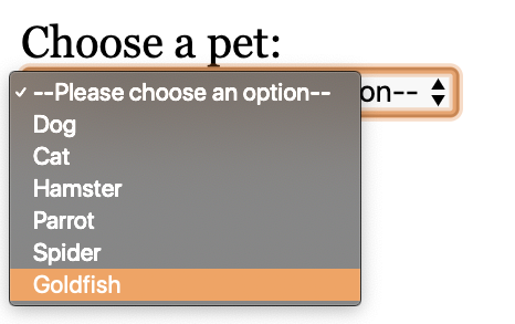
<select name="pets" id="pet-select">
    <option value="">--Please choose an option--</option>
    <option value="dog">Dog</option>
    <option value="cat">Cat</option>
    <option value="hamster">Hamster</option>
    <option value="parrot">Parrot</option>
    <option value="spider">Spider</option>
    <option value="goldfish">Goldfish</option>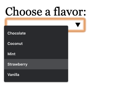
</select><input type="text" list="flavors" name="ice-cream">
<datalist id="flavors">
<option value="Chocolate"></option>
<option value="Coconut"></option>
<option value="Mint"></option>
<option value="Strawberry"></option>
<option value="Vanilla"></option>
</datalist>Flavor:
<input type="text" autocomplete="name">
on/off or different hints for form autofill
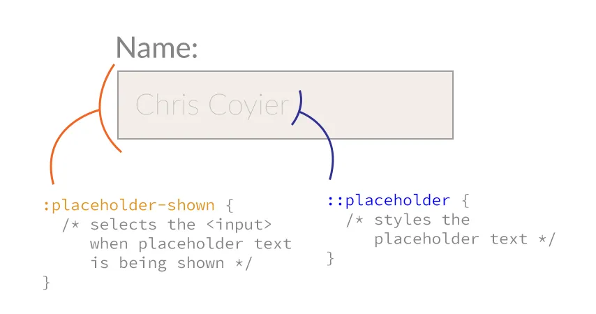
<input type="text" placeholder="YYMMDD">
content to appear in the textfield when it's empty, to give a hint on expected input
Birthday:
<input type="text" spellcheck="true">
Can be either true or false. Activates the built in spellchecker of the browser. Set to false for names etc.
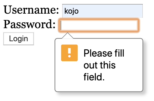
<input type="text" required>
If present, the form can not be submitted when the field is empty
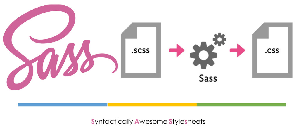
Kind of like Emmet for CSS
Compile to a CSS file
or
nav {
  ul {
    margin: 0;
    padding: 0;
    list-style: none;
  }

  li { display: inline-block; }

  a {
    display: block;
    padding: 6px 12px;
    text-decoration: none;
  }
}
nav ul {
margin: 0;
padding: 0;
list-style: none;
}
nav li {
display: inline-block;
}
nav a {
display: block;
padding: 6px 12px;
text-decoration: none;
}scss
css
a {
  text-decoration: none;
  color: white;

  &:hover {
    color: yellow;
  }
}
a {
text-decoration: none;
color: white;
}
a:hover {
color: yellow;
}
scss
css
h1 {
  font: {
    family: "Lato", sans-serif;
    size: 3em;
    weight: 400;
  }
}
h1 {
font-family: "Lato", sans-serif;
font-size: 3em;
font-weight: 400;
}scss
css
// Variables
$grey: rgb(150, 159, 170);
$v-space: 11px;

// Rules
aside {
  background-color: $grey;
  margin-top: $v-space;
}
aside {
background-color: #969faa;
margin-top: 11px;
}scss
css
// Variables
$grey: rgb(150, 159, 170);
$v-space: 11px;

// Rules
main {
  background-color: $grey;
  margin-top: $v-space * 3;
}
main {
background-color: #969faa;
margin-top: 33px;
}scss
css
brightness
$grey: #969faa;

h1 {
  color: $grey;
}

main {
  background-color: lighten($grey, 30%);
  color: darken($grey, 30%);
}
h1 {
color: #969faa;
}
main {
background-color: #ebecee;
color: #4b535c;
}scss
css
saturation
$grey: #7a9cc7;

h1 {
  color: $grey;
}

main {
  background-color: saturate($grey, 30%);
  color: desaturate($grey, 30%);
}
h1 {
color: #7a9cc7;
}
main {
background-color: #5e99e3;
color: #969fab;
}scss
css
opacity
$grey: rgba(150, 159, 170, 0.5);

h1 {
  color: $grey;
}

main {
  background-color: fade-out($grey, 0.2);
  color: fade-in($grey, 0.1);
}
h1 {
  color: rgba(150, 159, 170, 0.5);
}

main {
  background-color: rgba(150, 159, 170, 0.3);
  color: rgba(150, 159, 170, 0.6);
}
scss
css
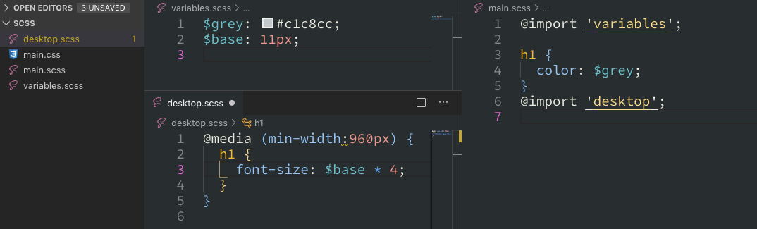
Merges other scss-files into one, before compilation.
Makes your scss files more modular
chunks of properties to reuse
@mixin menu-list {
  margin: 0;
  padding: 0;
  list-style: none;
  display: flex;
}

nav > ul {
  @include menu-list;
}
nav ul {
margin: 0;
padding: 0;
list-style: none;
display: flex;
}you can even use parameters...
$base: 11px;
@mixin font($size, $color) {
  color: $color;
  font-size: $size;
  line-height: $size * 1.25;
}

.big-red-text {
  @include font($base*3, red);
}

.small-black-italic-text {
  @include font($base+3, black);
  font-style: italic;
}
.big-red-text {
color: red;
font-size: 33px;
line-height: 41.25px;
}
.small-black-italic-text {
color: black;
font-size: 14px;
line-height: 17.5px;
font-style: italic;
}Merge properties from another rule
$gray: #c1c8ca;
$base: 11px;

.button {
  border: solid 1px $gray;
  font-size: $base * 2;
}

.submit-button {
  @extend .button;
  background-color: darken($gray, 20%);
}
.button, .submit-button {
  border: solid 1px #c1c8ca;
  font-size: 22px;
}

.submit-button {
  background-color: #8a979b;
}check out the Sass documentation for even more things you can do with Sass
By Johan Kohlin
Forms


