

Johan Kohlin
Lecturer at School of engineering, Jönköping University.
Grid & Tables -Chapter 8 + 16 (grids)
Web and user interface design
Chrome, Firefox, Safari and Edge
Internet Explorer 10 -11
a whole lotta properties. We will look at some
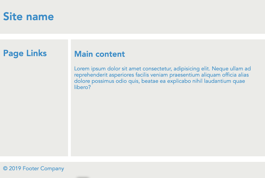
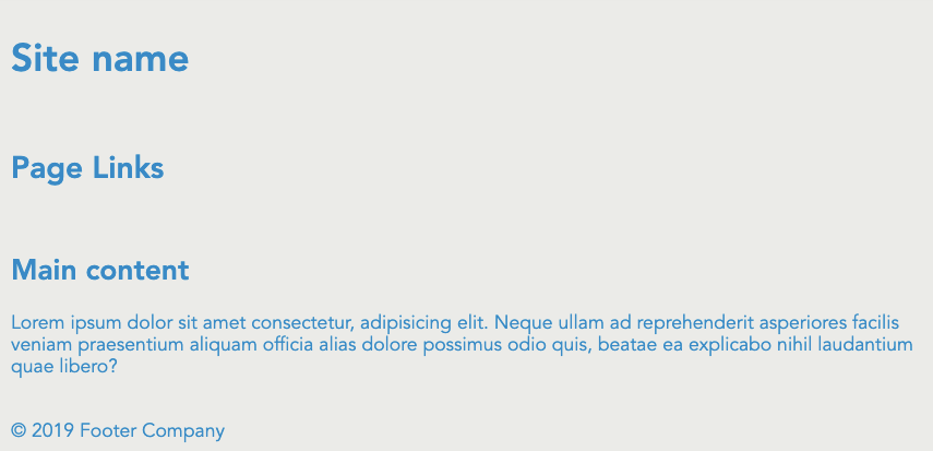
A grid contains of columns and rows
...and gaps
10 columns
each 66px wide
1fr
minmax(50px, 500px)
min-content
max-content
fit-content(max)
auto-fit
auto-fill
1
3
1fr
2fr
e.g.
1fr
minmax(50px, 1fr)
min-content
max-content
fit-content(max)
auto-fit
auto-fill
No smaller than 50px
No bigger than 1fr
1fr
minmax(50px, 500px)
min-content
max-content
fit-content(max)
auto-fit
auto-fill
Make the box as small as possible
Make the box as wide as it's content.
Lorem ipsum dolor
Lorem ipsum dolor
1fr
minmax(50px, 500px)
min-content
max-content
fit-content(max)
auto-fit
auto-fill
lorem ipsum dolor
lorem ipsum dolor
1fr
minmax(50px, 500px)
min-content
max-content
fit-content(max)
auto-fill
auto-fit
<div class="container">
  <div class="item item1"></div>
  <div class="item item2"></div>
  <div class="item item3"></div>
  <div class="item item4"></div>
  <div class="item item5"></div>
  <div class="item item6"></div>
</div>
.container {
display: grid;
grid-template-columns: 150px 150px 150px;
grid-template-rows: 150px 150px;
grid-gap: 1em;
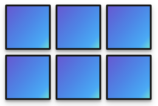
}All grid-items are automatically positioned like in a flex-wrap container
1
2
3
4
5
6
<div class="container">
<div class="item item1"></div>
<div class="item item2"></div>
<div class="item item3"></div>
<div class="item item4"></div>
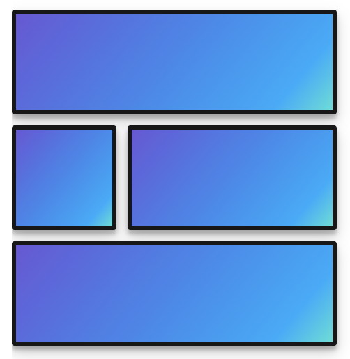
</div>.container {
display: grid;
grid-template-columns: 150px 300px;
grid-template-rows: 150px 150px 150px;
grid-gap: 1rem;
grid-template-areas:
"header header"
"aside main"
"footer footer";
}
.item1{ grid-area: header; }
.item2{ grid-area: main; }
.item3{ grid-area: aside; }
.item4{ grid-area: footer; }1
2
3
4
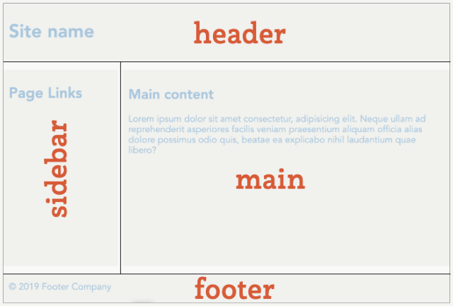
(grid parent property)
.container {
  grid-template-areas:
    "header header"
    "aside main"
    "footer footer";
}.container {
grid-template-areas:
"header header"
"aside main"
"aside footer";
}(grid-item property)
.container {
  display:grid;
  grid-template-areas:
    "header header"
    "aside main"
    "footer footer";
}

.item1{ grid-area: header;}
.item2{ grid-area: main;}
.item3{ grid-area: aside;}
.item4{ grid-area: footer;}Practice more at http://cssgridgarden.com/
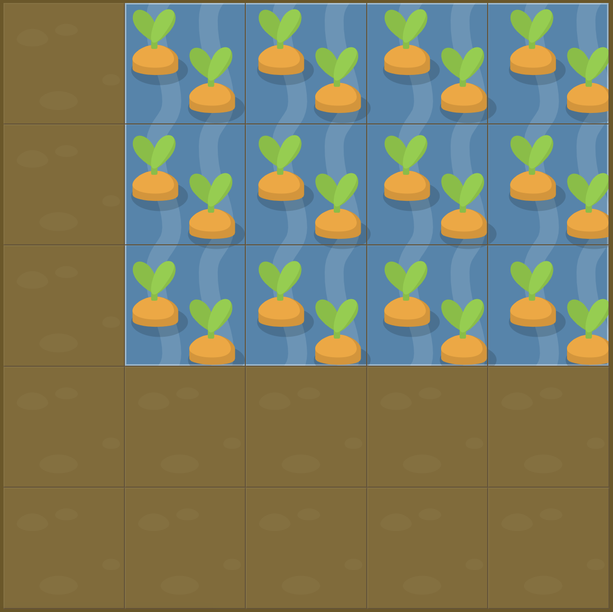
#garden {
  display: grid;
  grid-template-columns: 20% 20% 20% 20% 20%;
  grid-template-rows: 20% 20% 20% 20% 20%;
}

#water {
  grid-column-start: 2;
  grid-column-end: 6;
  grid-row-start: 1;
  grid-row-end: 4;
}start
end
center
stretch (default)
justify-items
align-items
start
center
end
stretch (default)
on grid container
start
end
center
stretch (default)
justify-self
align-self
start
center
end
stretch (default)
on grid items
<div class="container">
    <img src="sunset.jpg" alt="">
    <h1>Goodnight sunshine</h1>
</div>
.container {
display: grid;
grid-template-areas: "hero";
}
.container > img, .container > h1 {
grid-area: hero;
}
.container > h1 {
align-self:end;
margin:0;
padding:0.5em;
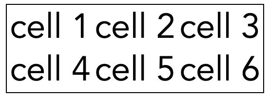
}for tabular data
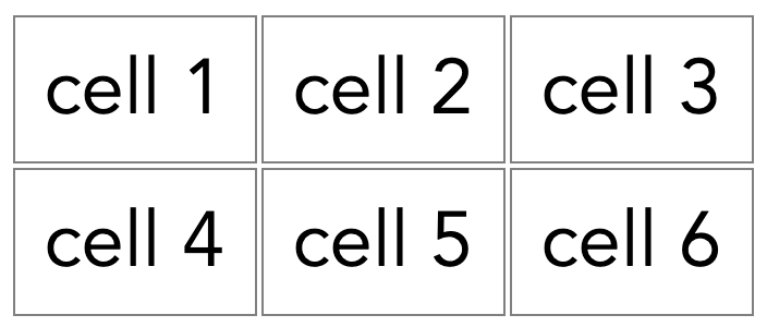
<table>
  <tr>
    <td>cell 1</td>
    <td>cell 2</td>
    <td>cell 3</td>
  </tr>
  <tr>
    <td>cell 4</td>
    <td>cell 5</td>
    <td>cell 6</td>
  </tr>
</table>
tr = table row
td = table data cell
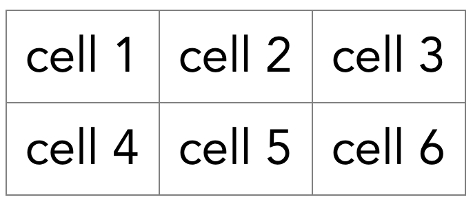
td {
  border:solid 1px gray;
}
table {
  border-collapse: collapse;
}
border-collapse: collapse
border-collapse: separate
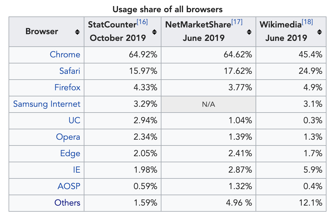
The table header contains the name of a column, typically in a bold font
Use scope=row/col
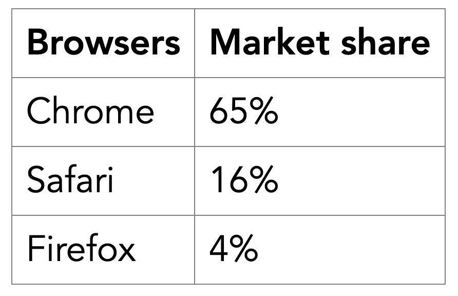
<table>
  <tr>
    <th scope="col">Browsers</th>
    <th scope="col">Market share</th>
  </tr>
  <tr>
    <td>Chrome</td>
    <td>65%</td>
  </tr>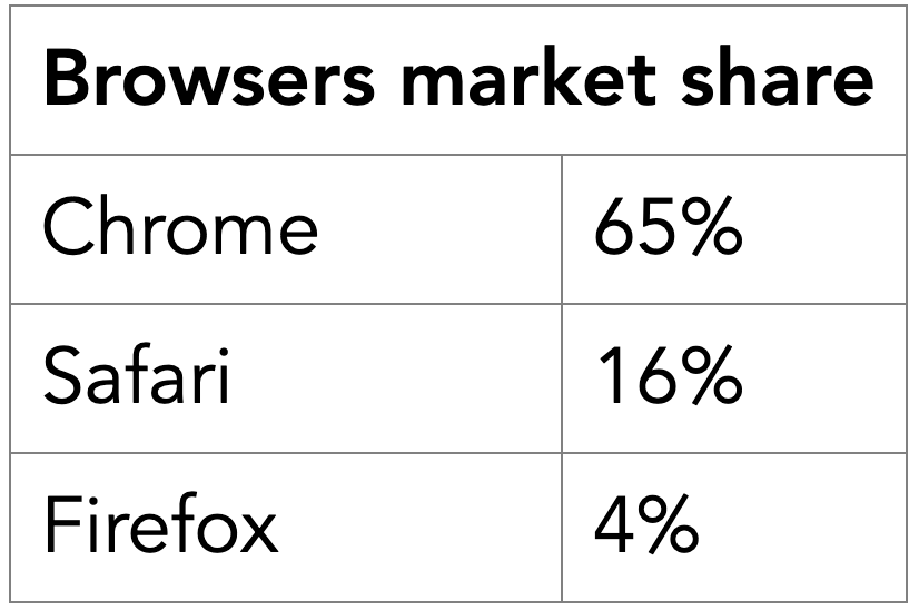
...colspan & rowspan attributes
<table>
<tr>
<th colspan="2">
Browsers market share
</th>
</tr>
<tr>
<td>Chrome</td>
<td>65%</td>
</tr>
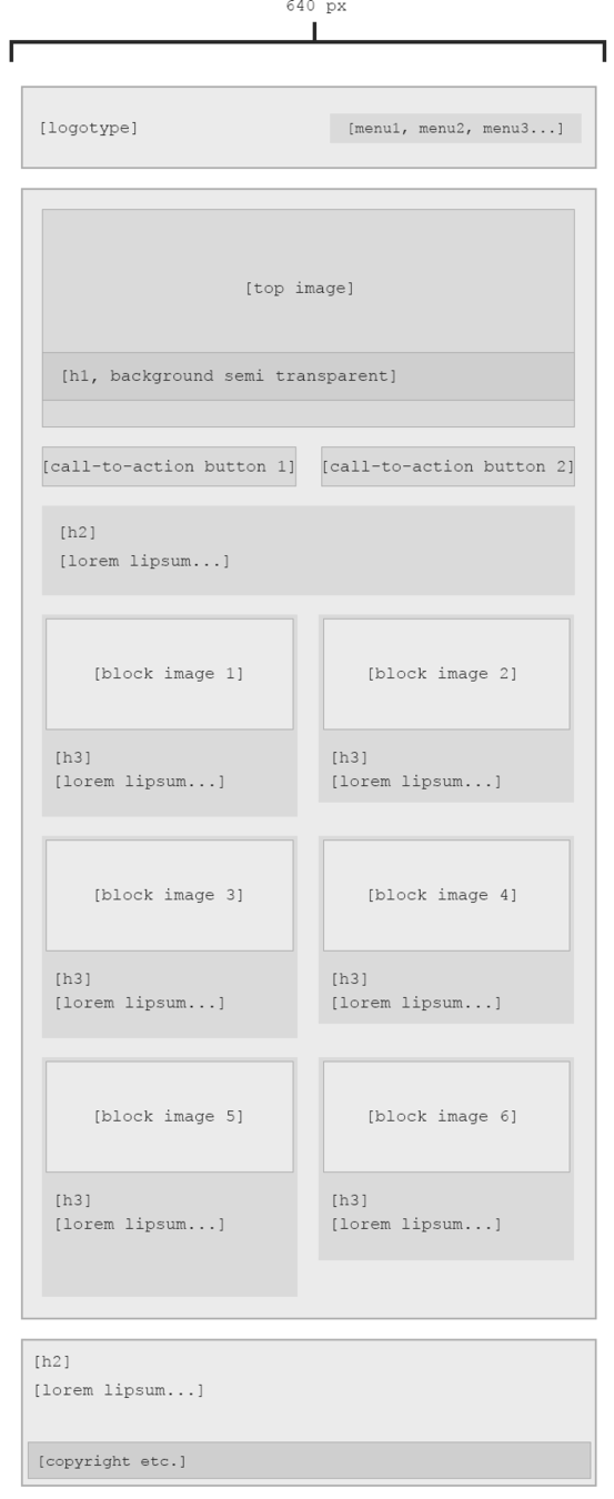
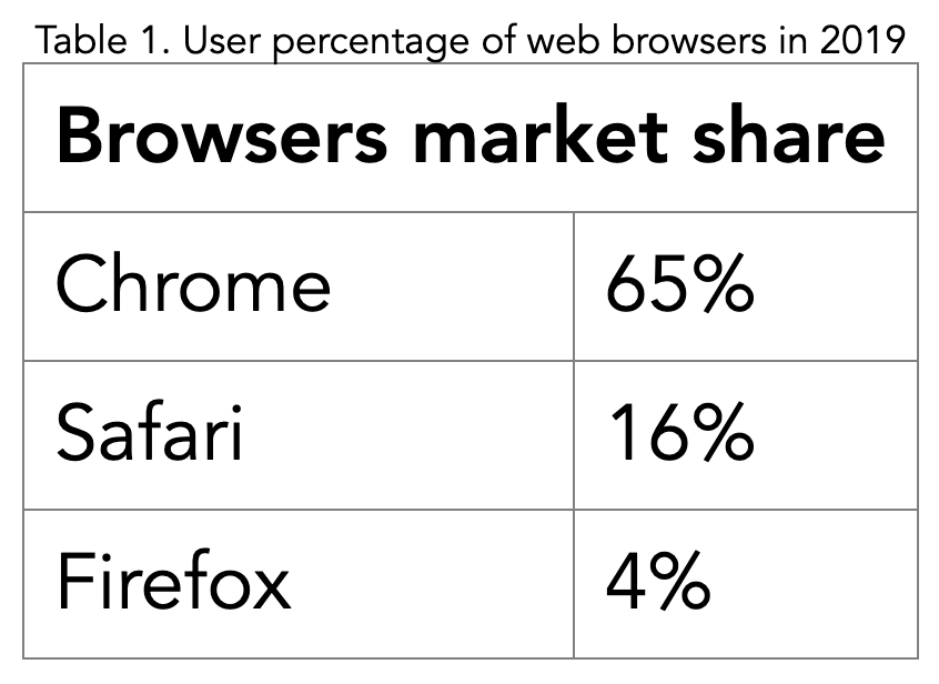
...A table should have a caption tag that describes its content.
<table>
  <caption>
  	Table 1. User percentage of web browsers in 2019
  </caption>
  <tr>
    <th scope="col" colspan=2>
    	Browsers market share
    </th>
  </tr>
...By Johan Kohlin
Grids & tables


