


Johan Kohlin
Lecturer at School of engineering, Jönköping University.
The lab
Simple and powerful tools for distributing space and aligning content
A parent property
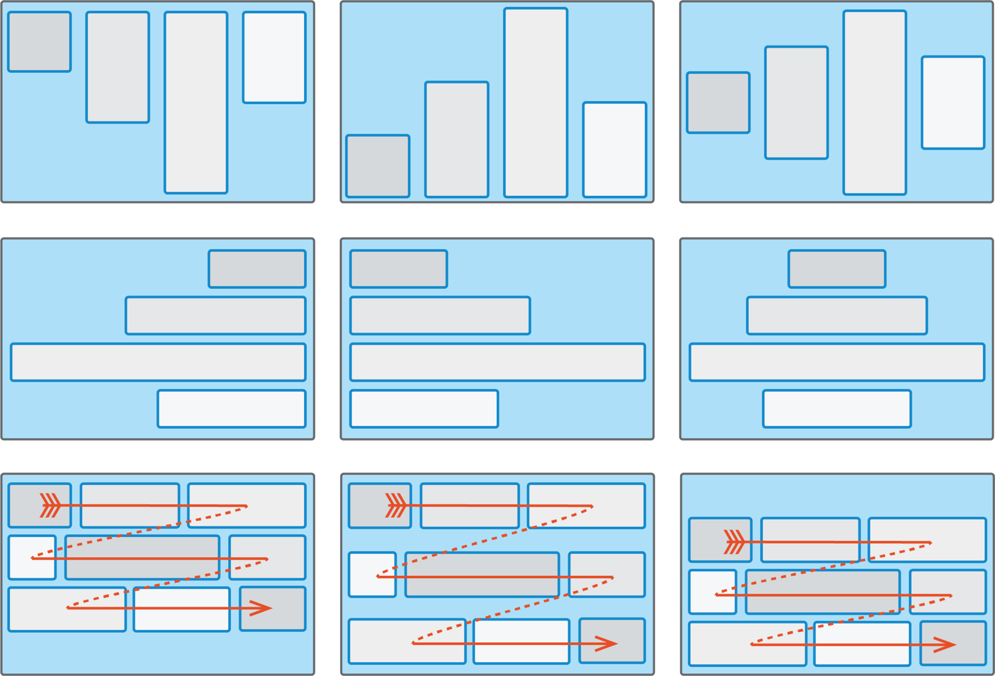
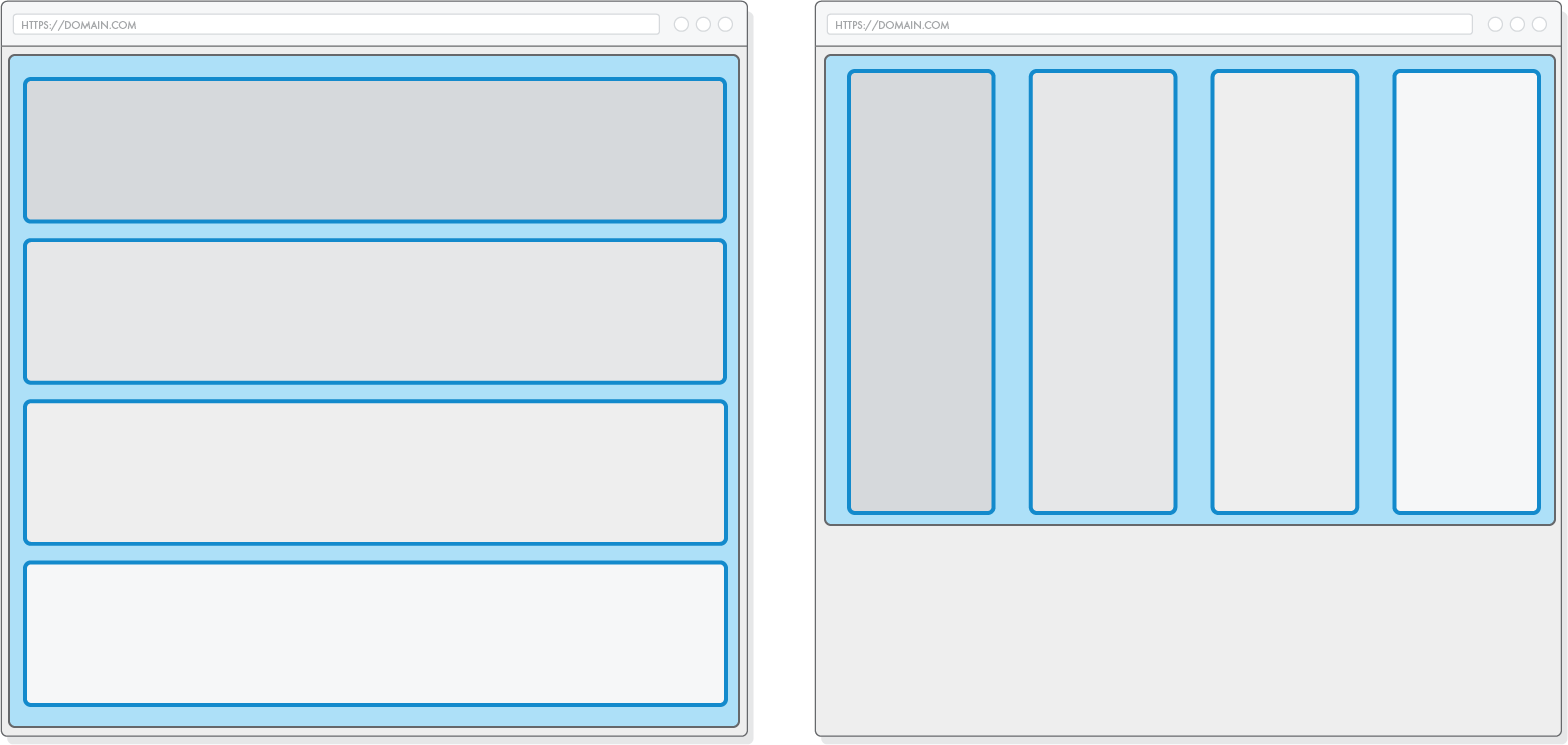
By default, makes child elements stack horizontally (in a row)
Item widths may differ and depend on each item's content.
All heights get stretched to match each other.
controls whether the flex container is single-line or multi-line
flex-wrap:wrap
flex-wrap:nowrap
Specifies the initial main size of the flex item, before free space is distributed according to the flex grow-/shrink factors
| Values | |
|---|---|
| auto | listen to width / height if present, otherwise sets to content |
| content | Automatic size based on the flex item’s content "optimal width" |
| <value> | any value that could be used for width |
| 0 | Smallest possible width. Longest word determine |
There's a little more to this but we'll get back to that when we talk about flex-direction
Determines how much a flex item will grow relative to the rest of the flex items in the flex container.
determines how much the flex item will shrink relative to the rest of the flex items in the flex container
Values: 0 or any positive number
default:0
default:1
shorthand for flex-grow flex-shrink flex-basis
flex: 1 0 200px;
/* is the equivalent of: */
flex-grow: 1;
flex-shrink:0;
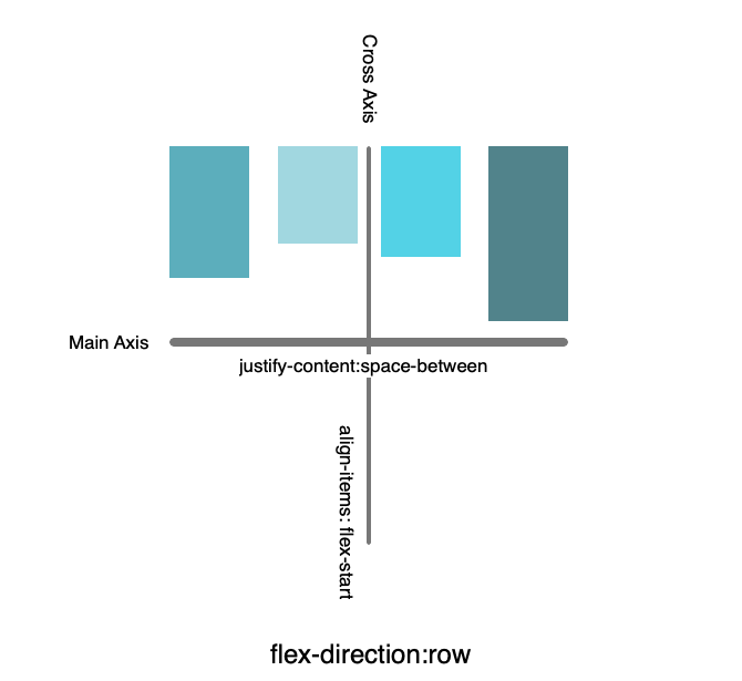
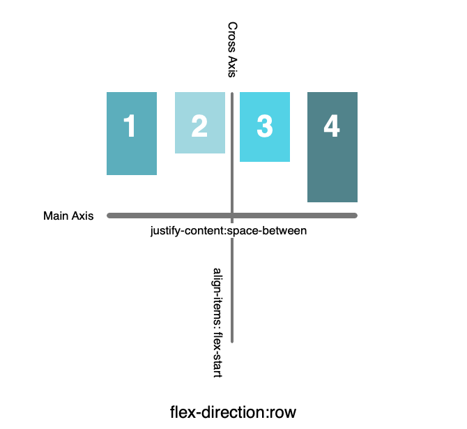
flex-basis: 200px;cross-axis alignment
main axis alignment
When there is space left in a flex container
A parent property to align flex items horizontally
There's a little more to this but we'll get back to that when we talk about flex-direction
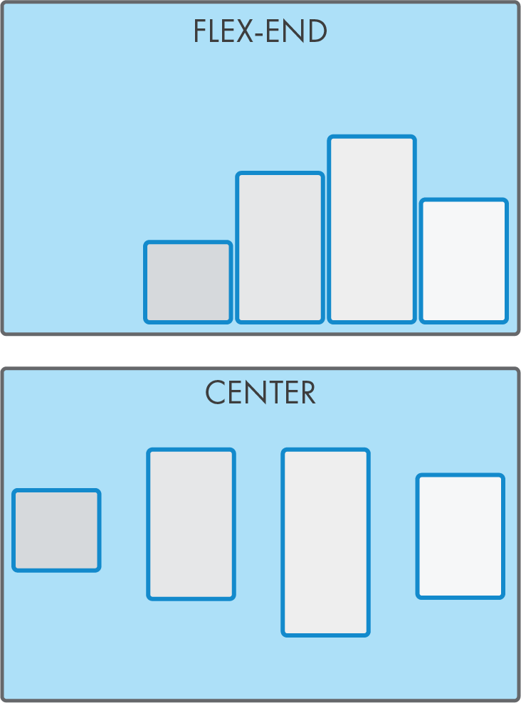
center
There's a little more to this but we'll get back to that when we talk about flex-direction
flex-start (default)
There's a little more to this but we'll get back to that when we talk about flex-direction
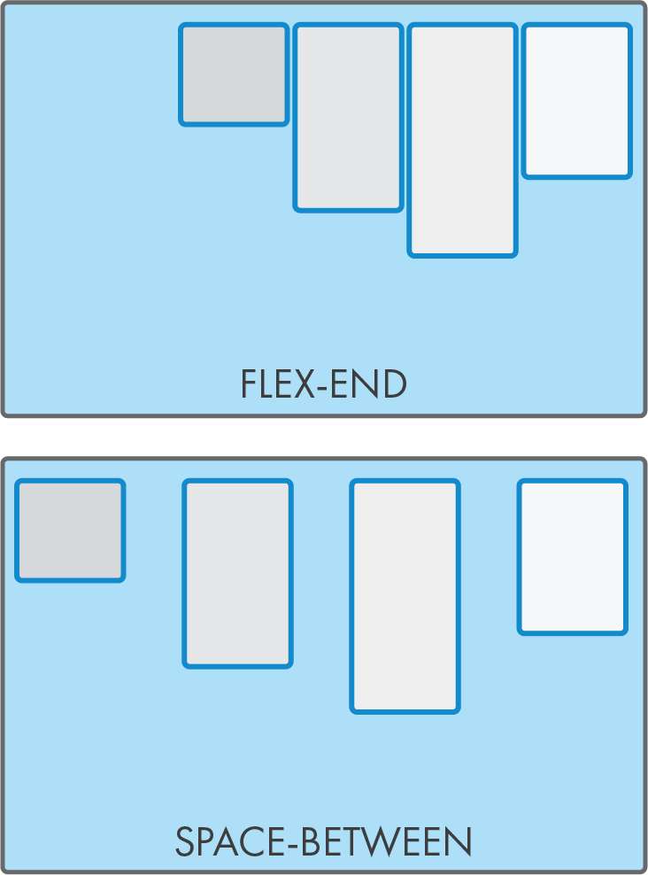
flex-end
There's a little more to this but we'll get back to that when we talk about flex-direction
space-between
There's a little more to this but we'll get back to that when we talk about flex-direction
space-around
There's a little more to this but we'll get back to that when we talk about flex-direction
space-evenly
A parent property to align flex items horizontally
| value | How child elements align |
|---|---|
| flex-start | |
| center | |
| space-between | |
| space-around | |
| space-evenly | |
| flex-end |
There's a little more to this but we'll get back to that when we talk about flex-direction
A parent property to align flex items vertically
There's a little more to this but we'll get back to that when we talk about flex-direction
center
A parent property to align flex items vertically
stretch (default)
A parent property to align flex items vertically
flex-start
A parent property to align flex items vertically
flex-end
A parent property to align flex items vertically
base-line
kind of center
make horizontal be vertical
Values
row (default)
column
row-reverse
column-reverse
Confusing behaviour!
When changing direction:
column-reverse
(when flex-wrap:wrap)
(when flex-wrap:wrap)
A flex-item property
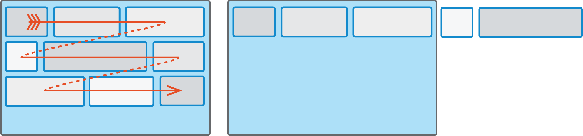
re-arranging flex items
/*
 * Lowest number goes to the left.
 * Negative numbers can be used.
 * 0 is default
 */

.post-image {
  order: -2;
}
.post-container {
  order: -1
}


/*for mobile */

.post-container {
  order: -2
}
.post-image {
  order: -1;
}
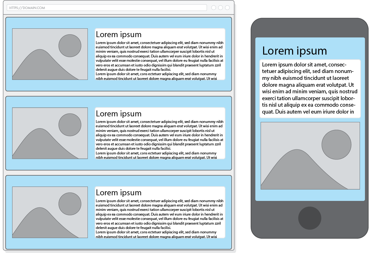
Make this codepen look like this mockup
menus in lists or not (read)
How a screen reader explains menus in lists
the basics
<ul>
    <li>Home</li>
    <li>Products</li>
    <li>About us</li>
</ul>
ul {
display: flex;
list-style: none;
padding: 0;
}Home Products About us
Ch 13 - Pseudo-elements
By Johan Kohlin
Focus on Flexbox display:flex justify-content flex-wrap flex-basis flex-grow/-shrink More selectors: Pseudo classes


