


Johan Kohlin
Lecturer at School of engineering, Jönköping University.
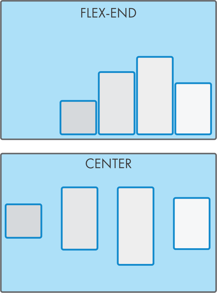
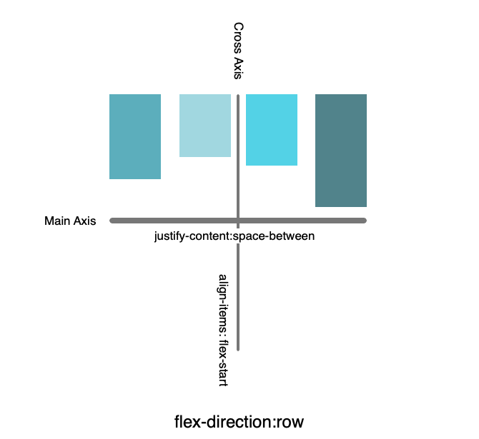
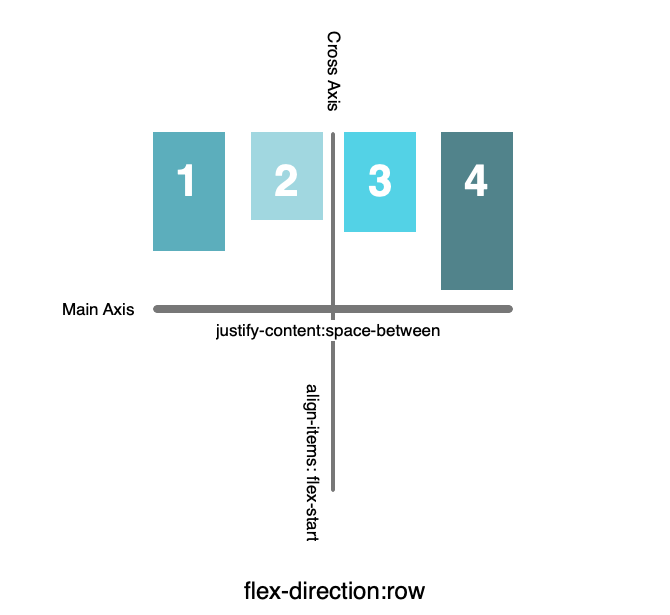
cross-axis alignment
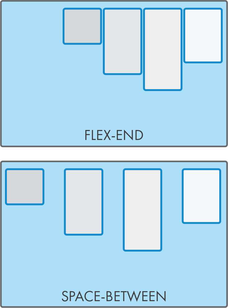
main axis alignment
make horizontal be vertical
Values
row (default)
column
row-reverse
column-reverse
Confusing behaviour!
When changing direction:
column-reverse
(when flex-wrap:wrap)
(when flex-wrap:wrap)
A flex-item property
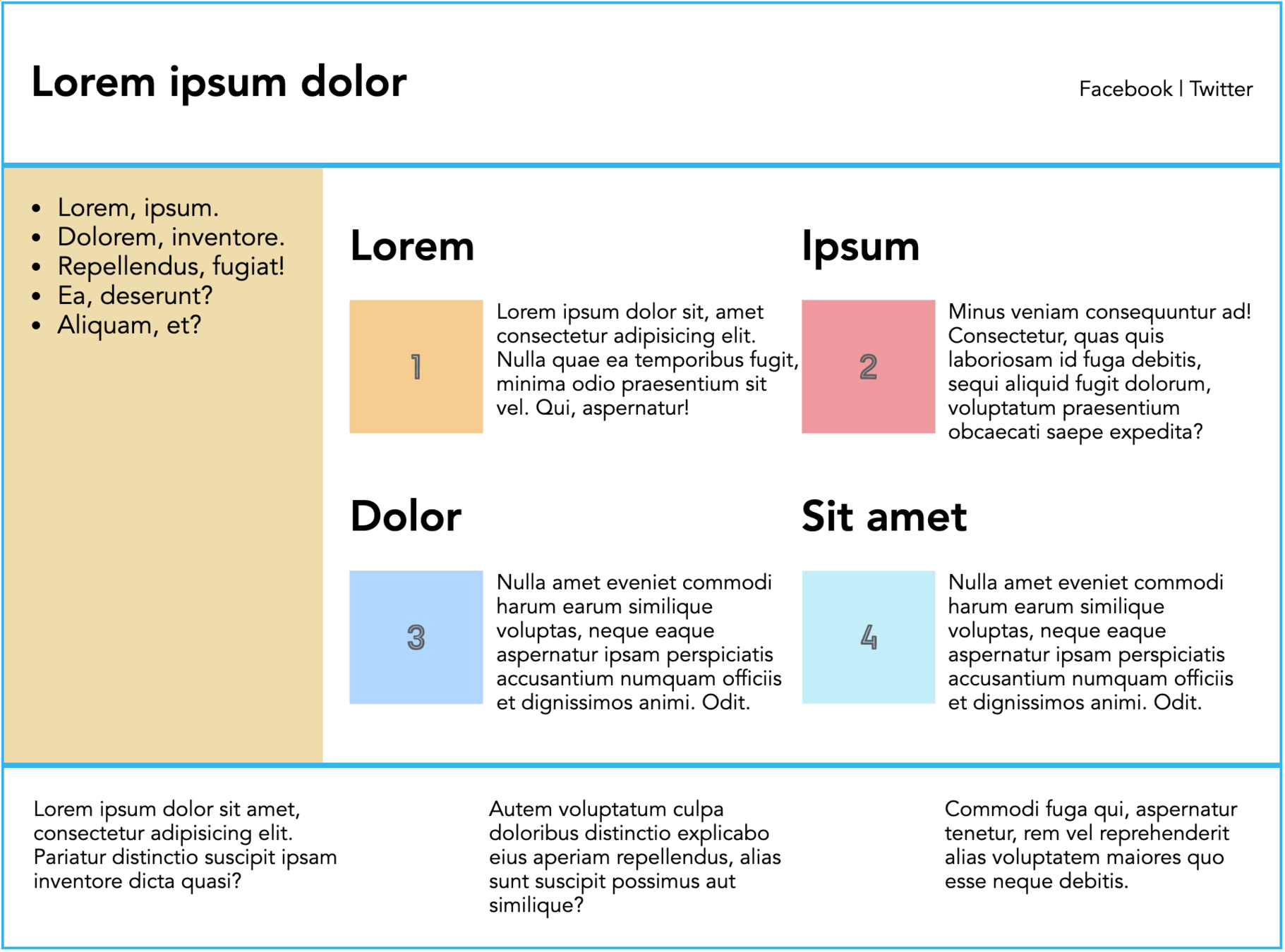
re-arranging flex items
/*
 * Lowest number goes to the left.
 * Negative numbers can be used.
 * 0 is default
 */

.post-image {
  order: -2;
}
.post-container {
  order: -1
}


/*for mobile */

.post-container {
  order: -2
}
.post-image {
  order: -1;
}
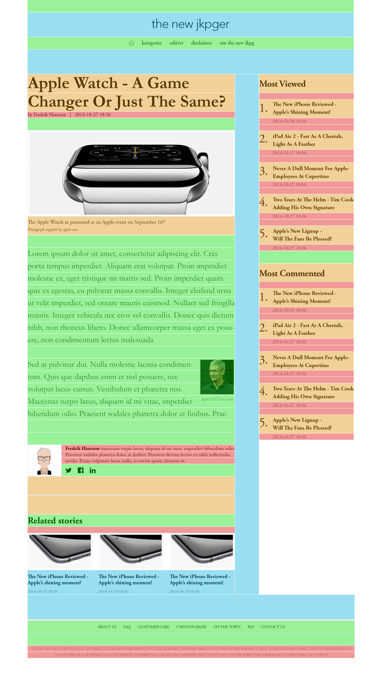
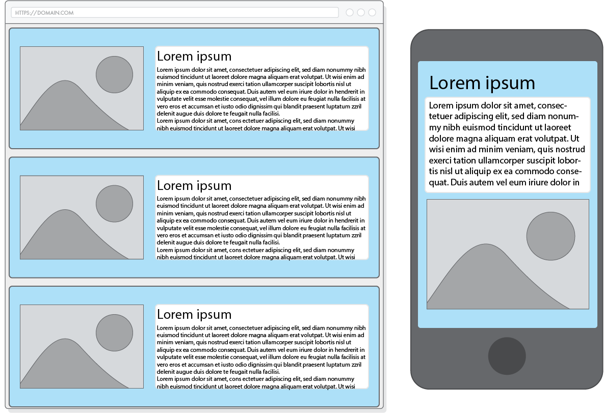
Make this codepen look like this mockup
menus in lists or not (read)
How a screen reader explains menus in lists
the basics
<ul>
    <li>Home</li>
    <li>Products</li>
    <li>About us</li>
</ul>
ul {
display: flex;
list-style: none;
padding: 0;
}Home Products About us
selector:pseudo-class
e.g.
a:hover
| pseudo-selector | description |
|---|---|
| :target | a document fragment that match the URL (ju.se#id) |
| a:link | unvisited link |
| a:visited | visited link |
| :hover | when mouse is over the selector |
| :active | mouse is pressed down (links and buttons) |
interactive pseudo classes
| pseudo-selector | description |
|---|---|
| p:not(.red) | all <p> except <p class="red"> |
| li:first-child | first element in a group of siblings |
| li:last-child | last element in a group of siblings |
| li:nth-child(n+1) | select which child in a group of siblings |
advanced selectors
add content using css
blockquote::before {
  content: ' ” ';
}
blockquote::after {
content: ' “ ';
}<blockquote>
<span> ” </span> <!-- Added before the content -->
To be, or not to be…
<span> “ </span> <!-- Added after the content -->
</blockquote>(not talking about display: grid)
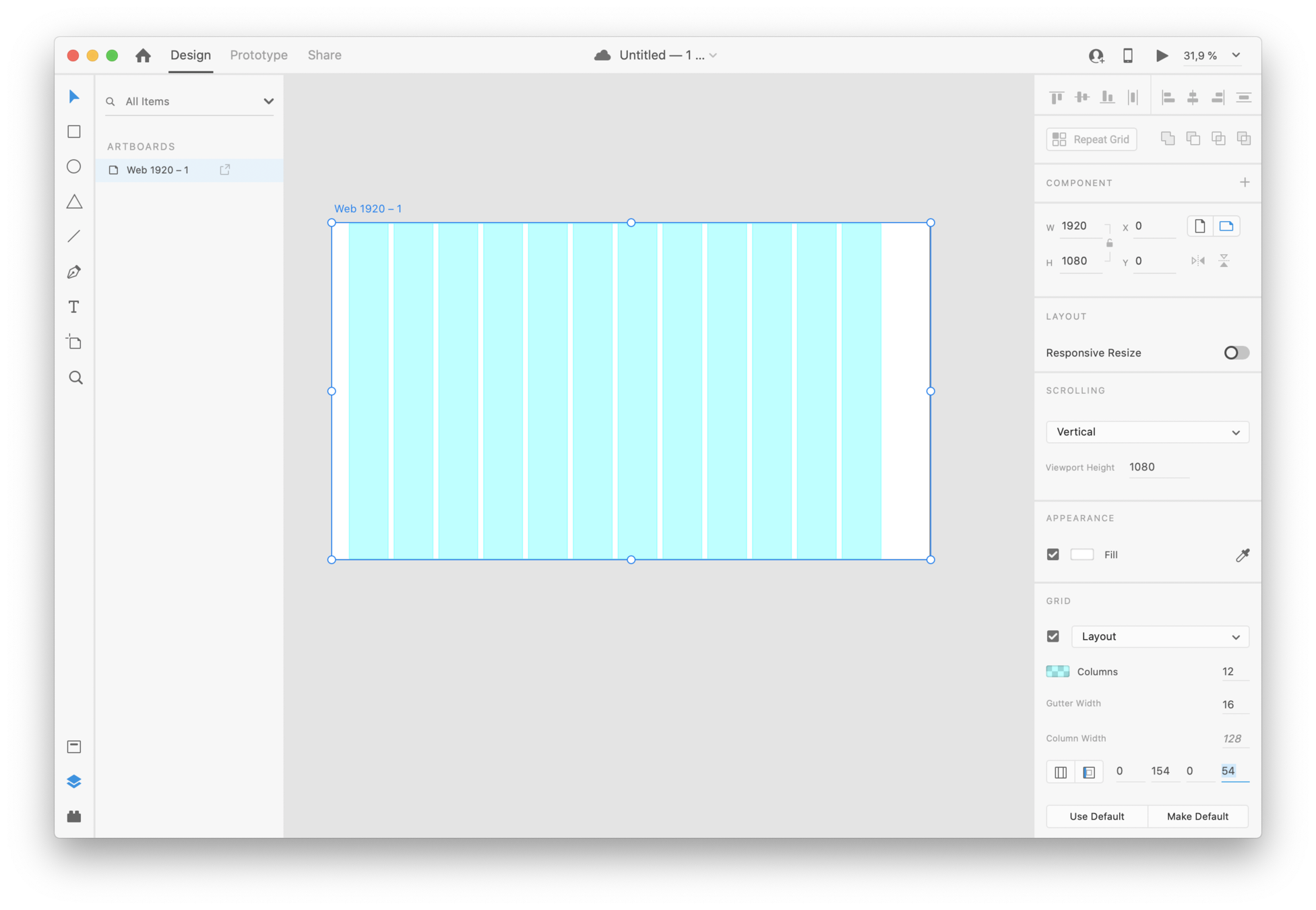
16 px
8 px
32 px
64 px
use the base square to decide on your layout grid
Font-size: 16px
line-height: 24px
column width: 12x8 = 96px
gutter: 32px
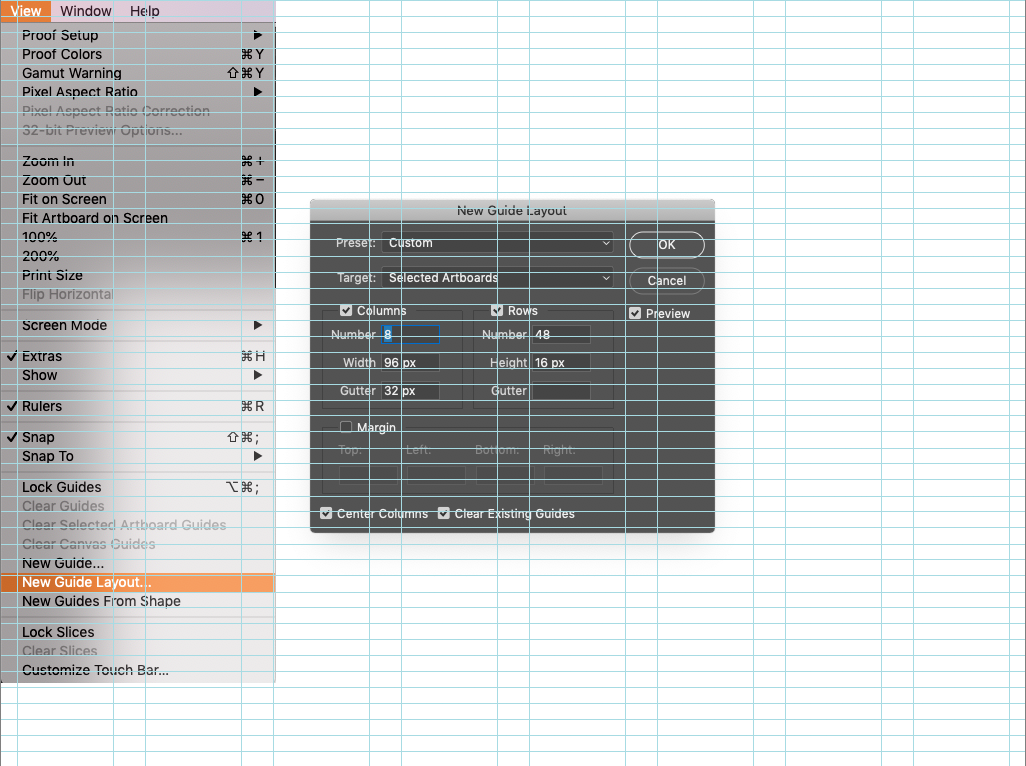
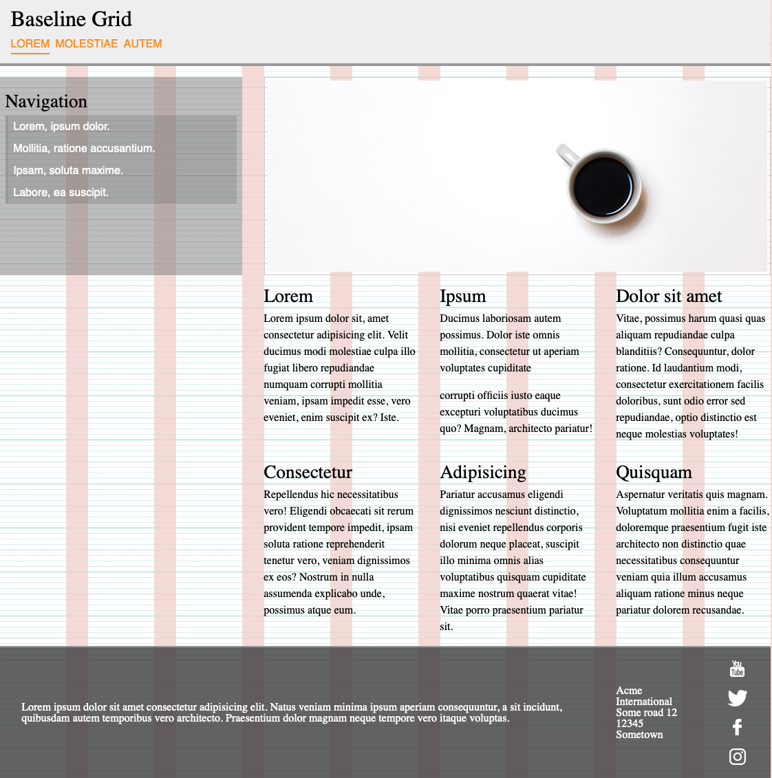
Easier to design with a visual grid
Create a grid piece in e.g. photoshop
Use as background
    body {
      margin:0;
      background-image: url('grid.png');
}A template background makes it easier to see that your doing it right
watch me build a website
By Johan Kohlin
Flex part II , pseudo classes, pseudo elements, creating your own baseline grid


